A uniform appearance (corporate design) strengthens the visibility of the brand »Friedrich Schiller University Jena« at home and abroad and creates identification among students, staff and alumni. Last but not least, a reliably applied uniform appearance promotes recognition and trust in our university among prospective students as well as partners from science, business and the general public.
In addition to logo, corporate colours and fonts, the corporate design also includes the language of images and forms. These components merge into a coherent overall image and thus offer the possibility to make the complex university structure with its faculties, institutes, chairs and administration visible, understandable and transparent.
Our Service
Members of the Friedrich Schiller University Jena we answer questions about the logo of the University of Jena, the corporate design and provide support in the creation of printed materials. We also provide tips on creating or publishing videos and help with questions about using graphics applications (software).
Please submit your service request via our ticket system: Submit a service requestExternal linkde
The logo of the University of Jena
Logo of Friedrich Schiller University Jena
Graphic: Friedrich-Schiller-Universität JenaA logo shapes identity and represents the institution it stands for. At the same time, it makes affiliation clear. The image-word mark of the Friedrich Schiller University Jena fulfils this task by combining the university’s seal with clear typography. It thus ties in with the tradition of the University of Jena and connects it with the present. Unambiguity, legibility and functionality characterise the university's logo.
-
What to consider
The seal is used exclusively in combination with the lettering so that the University of Jena can be clearly identified as the sender. If it is less than two centimetres in diameter in an illustration, it should not be used in the interest of legibility.
In order to unify the appearance of the University of Jena and at the same time be able to represent its diversity, the logo fits into the existing colour system. The seal and lettering of the new logo can be coloured in faculty colours. If both elements are used, the colour must be used for both.
The third element of the logo can be the name of a faculty or institution of the University. This new »graphic home« eliminates the need to develop separate logos. Font type, size and placement are fixed for the naming of the institution. The font colour can correspond to the faculty colour or the university’s main corporate colour.
The use of the logo and its correct reproduction are binding for all institutions of the University of Jena. Always make sure that the reproduction is true to the original, not distorted, true to colour and with sharp contours. A combination with other trademarks is not permitted. The name »Friedrich-Schiller-Universität Jena« is not translated into another language in the logo. For further guidance on the spelling of the university name, please refer to the Guidelines for Affiliation.
-
Use of the logo
Who may use the logo:
- Faculties, institutes, chairs and facilities of the University of Jena
if necessary with logo addition - Students, doctoral candidates of the University of Jena
in theses (cover sheet, cover, first pages and digital presentation) - Scientific institutions
in the context of cooperations and joint projects; also applies to other universities, state institutions, non-profit associations, etc. - Companies in the private sector
in the context of orders placed by the University of Jena, in particular for graphic, printing or programming services; result is used as print, web template or merchandising article by the University of Jena; in the context of joint projects of contract research or other research projects only after prior consent and agreed in writing; for reference purposes, commissioned companies are only permitted to mention their name - Schools
in connection with teacher training
with the addition »teaching school of the *logo*«.
How the logo is to be used:
Always make sure that the image is true to the original, undistorted, true-colour and sharply contoured. If the seal in an image is less than two centimetres in diameter, it should not be used in the interest of legibility.
Not permitted:
- oblique representation
- distorted representation
- modified representation
- incomplete representation
- representation on an unstable background
- representation of the seal without word mark
- other further development
- Faculties, institutes, chairs and facilities of the University of Jena
-
Word-image mark
Word mark of the University of Jena combined with the seal on different backgrounds
Graphic: Liana FrankeThe seal is in a fixed position in relation to the lettering. The seal, lettering, position and size relationship to each other must not be changed. Size ratios and proportions are defined as follows: The distance between the seal and the lettering is the reference size. The height of the lettering is twice the height of the seal. The protection area around corresponds to the reference size and must always complied with.
On light backgrounds, the logo should be displayed in black or in the corporate colour dark blue (C100, M70, Y10, K50). On dark backgrounds, the inverted version is used. Be careful to ensure that legibility is guaranteed by sufficient contrast between the background and the logo.
-
Word mark
Word mark of the University of Jena on different backgrounds
Graphic: Liana FrankeThe depiction of the seal is not mandatory. Especially if the size of the image is less than two centimetres in diameter, its use should be dispensed with in favour of legibility.
The lettering is a graphic element with firmly defined components, distances and sizes. The word mark is not translated into other languages. There are no abbreviated versions. The protection area around corresponds to the reference size.
-
Logo with addition
Word-picture mark of the University of Jena with two-line addition
Graphic: Liana FrankeLogo addition
To ensure that the sender is always clearly identifiable, it is possible to add the name of a faculty or university institution to the logo. This makes the use and development of separate logos unnecessary and undesirable. Font type, size and placement are fixed for the naming of the institution. The font colour can correspond to the faculty colour or the university's corporate colour.
Font: Roboto Condensed
Font size: The height of the font is the same as the reference size.
Placement: The first line sits horizontally on the lower baseline of the word mark. The logo addition may have a maximum of two lines. -
Logo in social media
Various examples of profile pictures of the social media accounts of the University of Jena
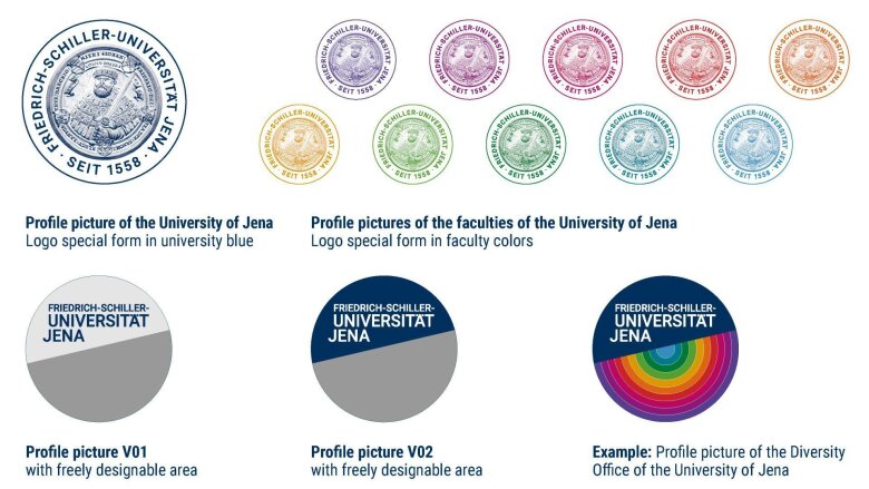
Graphic: Liana FrankeIn order to make the university visible and clearly recognisable in social networks, a special form of logo is kept for the mostly circular space for the profile picture. It consists of the seal, the surrounding name of the university and the addition »SEIT 1558«.
The profile picture of the University of Jena bears a special form of the logo in corporate dark blue. For the profile pictures of the faculties, the motif is coloured in the corresponding faculty colour.
Other departments and institutions are provided with a section of the profile picture: A fixed part of the circle contains the university's word mark in two different colour combinations (V01 & V02). The rest of the circle area can be designed flexibly. Only the insertion of letters and numbers is to be omitted.
-
Merchandising
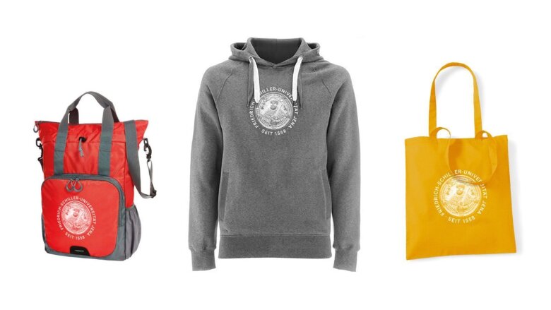
Bag, sweater and pouch printed with seal motif
Graphic: Liana FrankeThe merchandising products contribute to identify with the Friedrich Schiller University of Jena.
In the university shop, the special round shape of the logo is used for textiles and various articles. The special shape of the logo is not freely available. The adaptation to different printing materials and the associated quality assurance are tasks of the University Communication Department.
For items that go beyond the range of the Uni Shop (special orders), the University Communications Department, Marketing and Events Division is available for advice and, if necessary, support in procurement.
Colour system
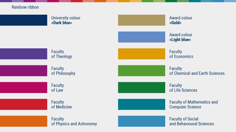
The university’s main corporate colour is dark blue. Light blue and gold are used as award colours.
The faculties are distinguished by an established colour scheme. Among other things, it is reflected in the »rainbow ribbon« component of the corporate design. The rainbow ribbon is used decoratively when all institutions are addressed or »speak« by themselves.
Color areas showing the color system of the Friedrich Schiller University of Jena
Graphic: Liana Franke|
University colours |
Colour values |
|---|---|
| University colour »dark blue« |
CMYK: 100, 70, 10, 50 |
| Award colour »gold« | CMYK: 20, 25, 60, 25 HKS: 98 K Pantone: 871C RGB: 174, 154, 99 HEX: #ae9a63 |
| Award colour »light blue« |
CMYK: 65, 40, 0, 0 |
|
Faculty of Theology |
Colour values |
|---|---|
|
Faculty of Theology |
CMYK: 80, 85, 0, 0 RGB: 87, 61, 144 HEX: #573d90 |
|
Faculty of Law |
CMYK: 15, 100, 25, 15 RGB: 185, 8, 95 HEX: #b9085f |
|
Faculty of Economics |
CMYK: 5, 40, 100, 10 RGB: 220, 152, 0 HEX: #dc9800 |
|
Faculty of Philosophy |
CMYK: 50, 100, 0, 10 RGB: 138, 24, 120 HEX: #8b1878 |
|
Faculty of Social and Behavioural Sciences |
CMYK: 70, 20, 0, 20 RGB: 55, 141, 188 HEX: #378dbc |
|
Faculty of Mathematics and Computer Science |
CMYK: 100, 25, 40, 10 RGB: 0, 122, 139 HEX: #007a8b |
|
Faculty of Physics and Astronomy |
CMYK: 10, 70, 100, 0 RGB: 220, 101, 19 HEX: #dc6513 |
|
Faculty of Chemical and Earth Sciences |
CMYK: 70, 10, 100, 5 RGB: 86, 158, 49 HEX: #569e31 |
|
Faculty of Life Sciences |
CMYK: 90, 30, 100, 10 RGB: 0, 119, 54 HEX: #007736 |
|
Faculty of Medicine |
CMYK: 0, 95, 80, 15 RGB: 203, 34, 41 HEX: #cb2129 |
House fonts
The font families »Roboto« and »Roboto condensed« are used as licence-free corporate fonts.
These font families are already incorporated in the available templates. For special highlighting, for typesetting long texts or where the variety of the other fonts is not enough, the »Roboto serif« or »Roboto Flex« can be used. You can find the fonts mentioned at fonts.google.comExternal link.
Visual language – people
People
The most important criterion for the selection of an image is authenticity. The aim is to send a strong, positive message. Therefore, university people in their everyday life should be shown, who are enthusiastic and concentrated in what they are doing. Photos from freely accessible image databases should be avoided. These are often arbitrary, interchangeable and not very meaningful.
Make sure that the persons pictured agree to the publication of the picture, especially when using it in social media.
Print out the consent form: DSGVO declaration of consent University of Jenapdf, 875 kb
Buildings and Jena
The authenticity of the imagery also plays a major role for buildings and localities in and around Jena. The advantages of the university town in the middle of greenery with historical and modern architecture are to be emphasised. Deserted or crowded spaces and squares are to be avoided. Disturbing objects such as traffic lights or traffic signs should also not be the focus of the motif.
Members of the University of Jena have the opportunity–subject to the terms of use–to access the photos from the in-house image database:
Do not forget to always name the author of the image – by name, directly on the work.
-

Image: Christoph Worsch (University of Jena) -

Image: Jan-Peter Kasper (University of Jena) -

Image: Sebastian Reuter -

Image: Jan-Peter Kasper (University of Jena) -

Image: Jan-Peter Kasper (University of Jena) -

Image: Jens Meyer (University of Jena) -

Image: Jens Meyer (University of Jena) -

Image: Jens Meyer (University of Jena) -

Image: Anne Günther (University of Jena) -

Image: Christoph Worsch (University of Jena) -

Image: Jens Meyer (University of Jena) -

Image: Jan-Peter Kasper (University of Jena)
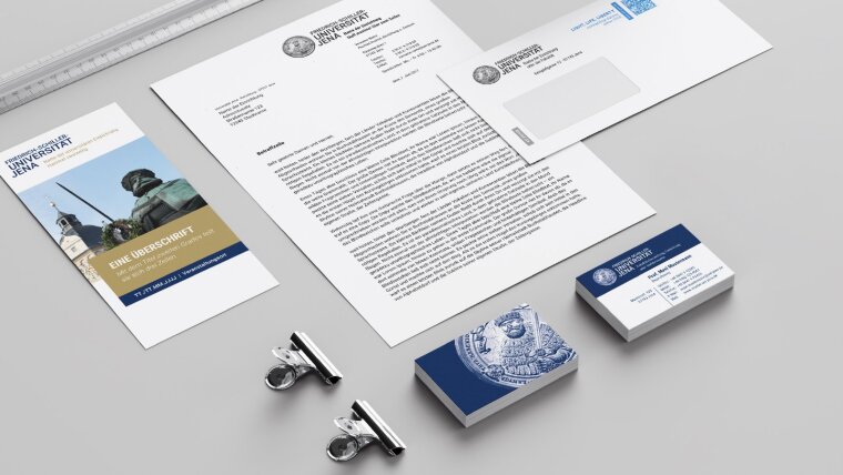
To make it easier for members of our university to work with the corporate design, we have put together numerous templates. After you have registered with your URZ login, you will find in our range, in addition to the logo in numerous variants, templates for:
- Backgrounds for video conferences
- PowerPoint presentations
- Letterheads and reports in Word
- Print media, such as invitations, notices, postcards, leaflets, brochures
- Profile pictures for social media
When naming the university, follow the Guidelines for Affiliation and use punctuation correctly. For example: the dash – and the »quotation marks« or the apostrophe abc’.
Contact
Liana Franke

Susanne Bukatz
